By KIM COOK
Associated Press
A hike in the woods or a stroll through a preserve or park can be enhanced by a good trail sign — one that is informative, easy to see, yet doesn’t intrude on the vista.
It’s a lot to ask of a sign designer.
“A wayfinding sign should be apparent when you need it. But when you’re not looking for directional information, its aesthetics should complement the environment so that it’ll feel as though it belongs there,” says Jeff Frank, lead designer at Corbin Design in Traverse City, Michigan.
Cost-effectiveness, durability, accessibility — and attractiveness — are all considerations in sign design, he says. For interpretive signs, a great deal of information often must be conveyed in a relatively small amount of space. And there’s branding; an aquarium or zoo, for instance, might want their logo incorporated into signage.
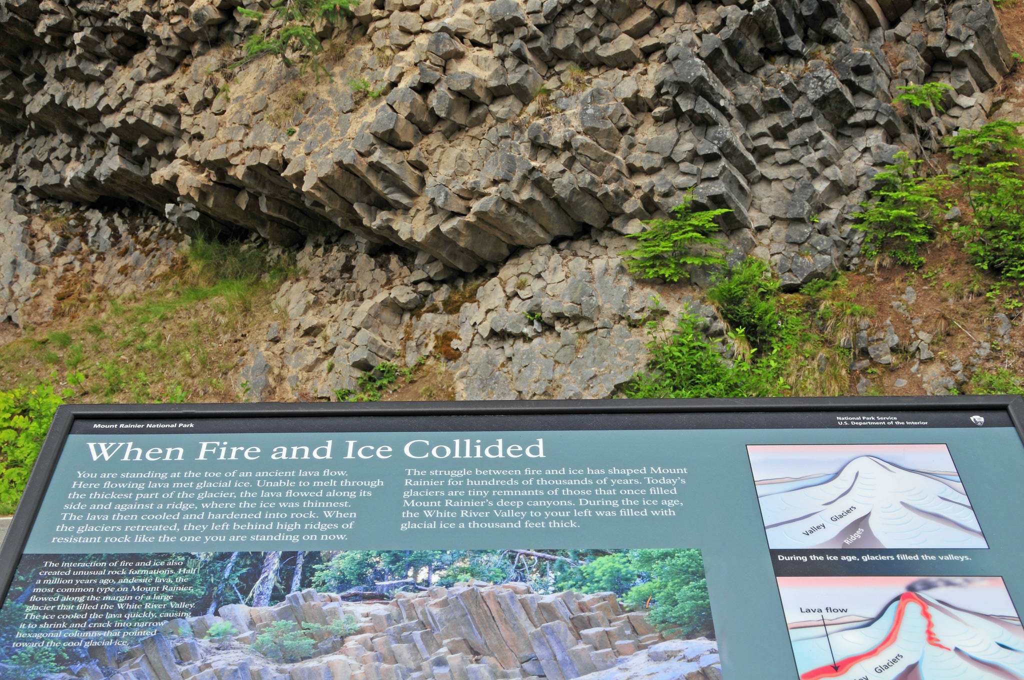
National Park Service signs have their own recognizable look. From the beginning, it was influenced by the “parkitecture” of hewn logs and stone: Signs depicted a sequoia cone, and later an arrowhead and mountains.
In the 1950s, an effort was made to create a more cohesive visual identity, says Phil Musselwhite, a North Carolina-based graphic designer and Park Service veteran. But that midcentury redesign of the logo — triangles and balls representing trees and cultural artifacts — met with a tepid response, and the arrowhead, bison and craggy vista were brought back. There’s been some tweaking since then, but no drastic alterations.
With the number of Park Service signs estimated near 800,000, Musselwhite says, “signs are the primary way the NPS communicates with visitors.” Some greet, some guide and some educate, but they’re all aimed at enhancing appreciation of the parks.
Individual parks can tailor signage to unique features, but a universal visual identity manual provides general guidance. For example, it suggests two typefaces — Frutiger and Rawlinson — on most outdoor signs, and horizontal panels with black borders. Visitors should be able to see at a glance a connection to the landscape. Information and imagery must be compelling, and the whole thing has to be easy to read.
And signs shouldn’t get in the way. They’re “captioning the landscape,” according to the Park Service’s Wayside Guide, the manual on exhibit standards and practices. So trailside or special feature panels stay low-profile, while wayfinding signage — trail routes, for example — are placed more prominently.
Scenic Hudson, a non-profit preservation organization, bought the West Point Foundry in Cold Spring, New York, in 1996 and the early ironworks has been turned into a preserve. Ravine trails and a restored waterwheel are punctuated with signage created by Manhattan-based design firm C&G Partners. Interpretive panels tell the story of the foundry’s role in the Civil War and Industrial Revolution. The signs carry the foundry’s original stamp typography, and archival images and etchings. Some of the wayfinding and interpretive panels are mounted on steel-mesh armature filled with artifact bricks gathered from the foundry ruins.
“When you build and refresh a place with an extraordinary history, the task is remarkably easy if you’re willing to respond to the information that lies in front of you,” says C&G’s Keith Helmetag.
Ecocreative, a design firm in Adelaide, Australia, was tasked with creating an interpretive display for the Murray Darling River Basin. How to tell people about 40 species of fish, and the community’s efforts to protect them, in a visitor’s center with no available wall space?
The team printed fish silhouettes on a polygonal pillar made out of eco-friendly plywood. The fish “swim” in one direction around the pillar, guiding the visitor’s eye.
At the Theodore M. Berry International Friendship Park on the Ohio River in Cincinnati, local firm Kolar Design brought the concept of a friendship bracelet to life by casting bronze medallions inlaid with symbols of each continent, and placed them at the garden’s intersections. At the park’s entrance, a pinwheel sculpture embossed with a braided motif welcomes visitors in eight languages.
High-pressure laminates have been a boon to the outdoor signage industry. The art is sandwiched between layers of hard material and given a weather-resistant seal that can handle the ravages of time, weather and occasional vandalism.
Materials like Dura-wood that look like wood have a plywood base and a resin finish that’s rugged and won’t rot. Steel alloys like weathering or corten steel don’t need to be painted, and develop a pleasing rusty look with exposure. Digital imagery can be fused onto aluminum or porcelain. Or designers can use lasers to carve art or information into wood and steel panels.
Touch-and-feel signage is fun for kids. For a new rhino exhibit at the Calgary Zoo, for instance, designer Marion Spencer teamed with F&D Scene Changes to cast an enormous replica of a rhino’s horn and scat, incorporated into a sign, as well as a textured panel like rhino hide. For the Butterfly Conservatory there, she created a touchable, realistic egg, chrysalis and larvae.

